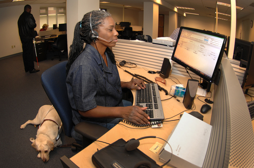
Accessibility is fascinating!
Accessibility. As an experienced developer you’ve surely heard of it. But as to what it means… Something about blind people not being able to use your app, right? Feeling vaguely guilty about not caring more about this, you approach management: if you can dump the problem with them, you won’t have to worry about it anymore. But what does management say? “You’re absolutely right, we need to get on this. Why don’t you look into what we need to do to get this right.”
That’s what happened to me some months ago. I decided I was going to use this time to thoroughly familiarize myself with the material. Starting out, I thought of accessibility as a difficult, vague topic. I associated it with outdated, overbearing government guidelines and ugly, blocky design. But as it turns out, accessibility is really a fascinating topic!
I see many parallels between accessibility and responsive design. With responsive design you’re concerned with making your website look good on devices with any kind of screen size. With accessibility you’re doing the same thing, but rather than screen size you’re concerned about constraints on input and output. Does the device consuming your website even have a screen? Or is reading your text out loud, or expressing it in braille? Is there a mouse, or can the user only use a keyboard, or voice commands?
An accessible website can be used by as many people as possible. And what kinds of audiences you need to consider is an interesting topic in itself. For instance: an elderly user who is slow to respond to any change, and doesn’t have a great memory. Or a person with dyslexia, or an RSI problem that prevents them from using a mouse. Take a look at the W3C article “Stories of Web Users” to read more about the various audiences using the web under some kind of constraint.

Now I can imagine that at this point you’re wondering whether it’s worth your time and effort to support what may be only a small percentage of your target audience. But these are the people who are hugely invested in finding websites that support them and often fail to find them. So if your company as one of the few in your branch of business does support these users, you’ve just become the go-to website for an entire subset of your audience.
Imagine if large portions of the internet were barely usable for you. That would hugely impact your opportunities in this modern world, where more and more parts of society are moving to the internet. No online stores for you, no streaming media. It might feel like your surfing the web in an old Netscape browser. It would work - barely - but the experience would be extremely frustrating. How long would you last under these circumstances?
Fortunately, it’s not at all hard to present your users with a well functioning website. If you stick to HTML standards and best practices (and you are, right?) then out of the box your website should already be reasonably accessible. It’s just that little extra piece that’s needed to really streamline the experience for people using Assistive Technology that requires you to put in effort and be creative. And that’s a fun challenge.
Take the alt attribute for instance. You know, that text you sometimes see when your browser fails to load an image. But there’s far more to it. Visually impaired people may not be able to see that image at all, relying instead on hearing or reading that text to understand what the image is about. So if there’s information in the image that’s crucial to understanding the page, it’s up to you to express that information in the alt text as well.
And coming up with the right text for that may not as easy as it first appears. There’s a lengthy WebAIM article about alt text that I highly recommend you read — it gives you a lot to think about and even includes a fun multiple-choice quiz. For example: it had never occurred to me that in certain situations the thing to do is leave the alt attribute empty (the presence of the attribute is required, but its value can be empty).
You know who else reads that alt text? Google. Because of course a bot won’t know what’s in your image either. (Not yet at least - they’re working on it.) So a good alt text improves your SEO score.
This is a pattern you often see: by increasing the accessibility of your website you get additional benefits for all your users. This point is brought out clearly in a series of videos on YouTube that I recommend: “Web Accessibility Perspectives”. Take a look! The videos are very well produced and make interesting points. Their motto is “Accessibility: essential for some, useful for all.”
I second that.
P.S.: I took some notes on accessibility while I was doing all this research. If you want to get started improving your app’s accessibility, they point out many resources to help you get underway.